
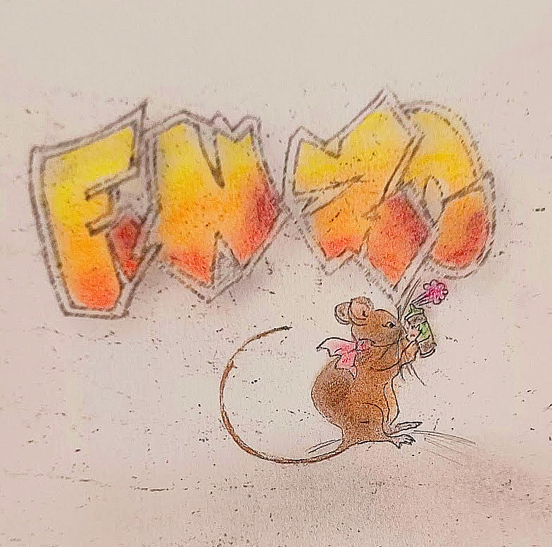
Each commissioned work is 5″x7″ with watercolor, pastel chalk and pastel pencil. Each individually created with the help of Prudence the Rat, as she is particular about her appearance.
The Farm Series

The classic Capital letter combined with the a calligraphic freestyle shows both strength & softness for Prudence’s new baby, as the little one grows up on her farm attuned to all the seasons of hard work & enjoyment.
The Classical Series
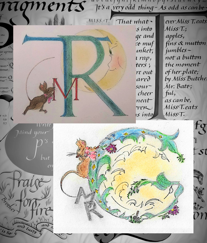
Lettering is based upon classical calligraphic fonts and styles. See, Child, Heather. More Than Fine Writing. The Life and Calligraphy of Irene Wellington. New York: Overlook Press, 1987. Print.
The Graffiti series

The lettering is adapted from “Street Font” and its free use with attrition.


NFS
Contact for more information.
